.png)
.png)
Good composition is a key element of good photographs yet is something that to me, that is hard to define. It is also something I feel I will never get to a point and say “okay, I can stop working on my composition now, I’m pretty good.” It is something that changes with every photograph, and something that can really ‘make or break’ an image. It is also something that any photographer needs to really train their eye to see and look for. And for a lot of us, it is something that we can see in everything around us, but need more fine tuning on learning how to capture what we see…for me its a mixture of it all, which is why I’ve set out on this journey I love so much!
I think it is easiest to think of composition as a list of ingredients that can be mixed together to make some fantastic dessert. Sometimes you crave a little chocolate, sometimes something fruity, salty, etc. etc. Same thing with photography, sometimes you want a little mood lighting, sometime you find an exciting texture etc. etc. Whenever taking a photo, depending on what you feel like, you can take some “ingredients” out of your pantry at any given time to construct a great image!
The key is to remember that in the same way as a chef rarely uses all the ingredients at their disposal in any dish – that a photographer rarely uses all of the ingredients of composition in the making of an image.
To me, there are ten main ingredients (tools, elements, functions) of composition that can be drawn upon to make capture a great image. It’s hard to say they are “rules” you should follow, as composition is one of the great things that make photographers individually unique artists, however they are considerations to make when setting up any shot. Take a little time when looking for a great shot, or setting up your shot to think about a few of these and good luck in capturing your best image yet!
1. {Pattern}
There are patterns all around us if we only learn to see them.
Emphasizing and highlighting these patterns can lead to striking shots, just at can highlighting a broken pattern.
When it comes to capturing repetition in photography a couple of techniques come to mind – you can either emphasize it or break it.
Filling your frame with a repetitive pattern can give the impression of size and large numbers. The key to this is to attempt to zoom in close enough to the pattern that it fills the frame and makes the repetition seem as though it’s bursting out (even if the repetition stops just outside of your framing).

(Image from stephen seaton photography)
Some examples of this technique might include faces in a crowd, bricks on a wall, a line of bicycle wheels all on the same angle etc. Almost any repeated appearance of objects could work.

(image from chey_israel)
The other common use of repetition in photography is to capture the interruption of the flow of a pattern. For example you might photograph hundreds of red M&Ms with one blue one.
Sometimes you’ll find these broken patterns naturally appearing around you and on other occasions you might need to manipulate the situation a little and interrupt a pattern yourself.
Broken repetition might include adding a contrasting object (color, shape, texture) or removing one of the repeating objects.
Pay particular attention to where in your frame to place the break in the pattern. It might be that the rule of thirds comes in to play here.
Also consider your focal point in these shots – the broken pattern might be a logical spot to have everything focused sharply.
2. {Symmetry}
Depending upon the scene – symmetry can be something to go for – or to avoid completely.
A symmetrical shot with strong composition and a good point of interest can lead to a striking image – but without the strong point of interest it can be a little predictable.
I know that compositional rules like the rule of thirds say to put your main object off center to create more interest in your shot (and I agree that it usually gets the best results) but sometimes the most stunning shot is the one when you put the main point of interest slap bang in the middle of your shot and where there’s real symmetry in the image.
As a result I’ve trained myself to always take at least two shots – one looking for to use the rule of thirds and asymmetry and the other with as much symmetry as possible.
Assymmetrical:
Symmetrical: (sort of. technically it should be the same on both sides)
The beauty of digital photography is that it doesn’t cost any more to take two shots than one and the results of doing so mean when I get back to my desktop I have the choice of two shots of most scenes.
3. {Texture}
Capturing a photo is a two dimensional thing, however, with the clever use of ‘texture’ they can come alive and become almost three dimensional.
Texture particularly comes into play when light hits objects at interesting angles. Casting shadows and producing highlights that really make the vibrancy of an object pop.
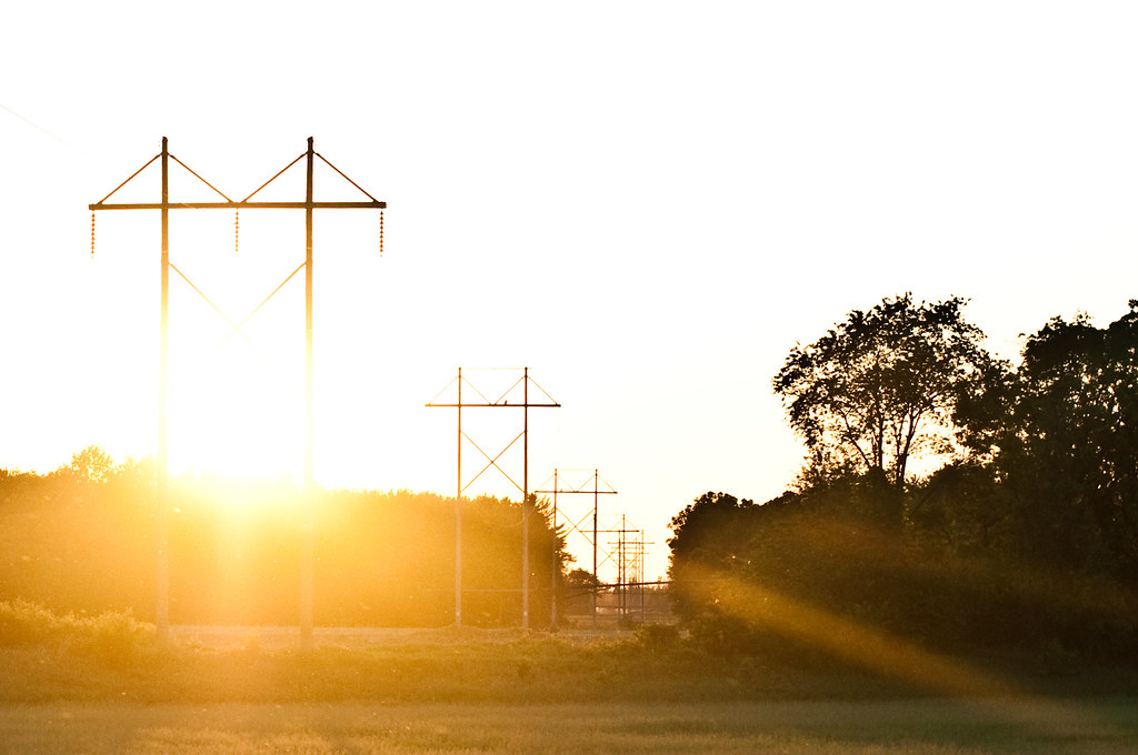
Here is a picture of a farm field, where the light has kissed the high-points and laid the low points to rest really emphasizing the rows of crop that are growing.
4. {Depth of Field}
The depth of field that you select when taking an image will drastically impact the composition of an image.
It can isolate a subject from its background and foreground (when using a shallow depth of field) or it can put the same subject in context by revealing it’s surrounds with a larger depth of field.
How to get shallow depth of field:
Positioning of Subject
One of the easiest things you can do is position the subject you’re wanting to photograph as far away from any objects behind them as possible. If they are standing right in front of a wall you’ll probably end up with it in focus no matter what else you do – but if they’re standing 100 meters in front of that same wall it’s going to be a lot more blurry. Of course this will only get you so far – you’ll need to do some of what’s coming next as well.
Portrait Mode
Most cameras now days have little helper buttons. One of them is often portrait mode, (often looks like a little head). This icon is the symbol for portrait mode and if you’re not confident with changing apertures (we’ll discuss this below) it’s a good mode to switch to as it will do some of the work for you. Portrait mode chooses a large aperture (a small ‘f’ number) which will make the depth of field (the amount of your shot in focus) smaller.
Aperture Priority Mode
Aperture Priority Mode is a great way to control depth of field as it will ensure your images are well exposed. This is like we talked about in “A” week. If you missed that lesson check it out to learn more about apeture!
If you’re feeling a little more adventurous switch the wheel to ‘A’ which is Aperture Priority Mode (this is mainly for SLR owners). This semi-auto mode is a great way to control depth of field as it will ensure your images are well exposed. For shallow depth of field and nice blurry backgrounds choose a large Aperture (the smaller the number the larger the aperture). Try taking a few shots at different apertures and see how it affects the background of your shots – this is the best way to learn how to get more creative control in your shots.
5. {Lines}
Lines can be powerful elements in an image.
They have the power to draw the eye to key focal points in a shot and to impact the ‘feel’ of an image greatly.
Diagonal, Horizontal, Vertical and Converging lines all impact images differently and should be spotted while framing a shot and then utilized to strengthen it.

6. {Framing}
Most of us use ‘frames’ to display our images when we hang them on walls for viewing – however ‘framing’ can be used within the composition of a shot to help you highlight your main point of interest in the image and and/or to put it in context to give the image ‘depth’.
Frames serve numerous purposes:
1. It gives the image depth and helps to give the perception to viewers of it that they’re looking at something that is more than 2 dimensions.

2. Use correctly, framing can draw the eye of the viewer of an interest to a particular part of the scene.
3. Framing can bring a sense of organization or containment to an image. This won’t work with every shot – but if you’re after a more ordered or formal feel it can be useful.
4. Framing can add context to a shot.
Frames can take many forms – from an overhanging tree, a window, a bridge, arch or even part of another person etc. When using this technique – look for a frame that has a similar shape to the main subject that you’re framing.

Frames can also be in the foreground or background of images (although more often than not they’re in the foreground).
7. {Perspective}
The perspective that a shot is taken from is another element that can have a big impact upon an image.
Shooting from up high and looking down on a subject or shooting from below looking up on the same subject drastically impact not only the ‘look’ of the image, emphasizing different points of interest, angles, textures, shapes etc – but it also impacts the ’story’ of an image.
Experiment with getting down as low as you can or find a way to climb above them and you might just find yourself discovering a new angle on your subject that adds that special something to how they express themselves in an image.
8. {Space}
There can be a fine line between filling your frame with your subject (and creating a nice sense of intimacy and connection) and also giving your subject space to breath.
Either technique can be effective – so experiment with moving in close and personal and moving out to capture a subject in its context.
Sometimes it is what you leave out of an image that makes it special
While empty spaces can be used effectively in photos to create stunning results you’re much more likely to get a ‘wow’ from those looking at your photos if your shots are filled with interest.

People
This technique is particularly important when taking pictures of people whose facial features tend to disappear when you move more than a few meters away from them.
While it can be appropriate to take shots that put a person in context with the environment that they are in, if they get lost in the picture you might as well just take a shot of the scene and leave them out of it.
9. {Balance}
The positioning with elements in a frame can leave an image feeling balanced or unbalanced.
Too many points of interest in one section of your image can leave it feeling too ‘heavy’ or complicated in that section of the shot and other parts feeling ‘empty’.
I’m not talking about symmetry – images don’t need to be the same on each side – but sometimes images can be improved greatly by having a secondary point of interest counter balancing the main focal point of an image and providing those ‘empty’ spots with a little weight.
Achieving Balance in shots is something that photographers learn over time. The best way to learn it is to scan through some of your older images, looking for those that could be more balanced.
Of course each situation will be different and getting balance in your shots might be achieved by a variety of techniques including:
- cropping (sometimes some post production processing will achieve a lot)
- altering your shooting view point (shooting from higher up or lower down)
- zooming (more tightly cropped or wider angles)
- moving an element of your picture (sometimes scenes can be rearranged)
10. {Color}
The colors in an image and how they are arranged can make or break a shot.
Bright colors can add vibrancy, energy and interest – however in the wrong position they can also distract viewers of an image away from focal points.
Colors also greatly impact ‘mood’. Blues and Greens can have a calming soothing impact, Reds and Yellows can convey vibrancy ad energy etc.
Some other things I think about (sometimes):
Motion
Silhouette
Vanishing points
I hope you find my “C” lesson useful! Now onto my “C” pictures for the week. I’ll admit, I didn’t spend as much time capturing these images as I should have, but thanks to a great day in Stevens Point I was able to capture a few “c’s”….enjoy!
And so begins the tale of the furry caterpillar…..
…caterpillar captured….
…caterpillar circus…
…and finally, cool caterpillar composition 🙂
Chick-a-dee.
Cardinal.
and cows 🙂
Thanks for stopping see you next week!! Depth of Field {and all of it’s friends} will be discussed!